I was recently published in Advertising Age with an article I wrote called “Responsible Personalization: How Brands Can Build Trust With Consumers.” Please take a look and share!

I was recently published in Advertising Age with an article I wrote called “Responsible Personalization: How Brands Can Build Trust With Consumers.” Please take a look and share!
I recently wrote an article called, “Reusing Tabs or Fields From an Existing Dialog” showing the benefits and steps to include previously defined dialog tabs and fields in another component for reuse. The article gained some traction when it was shared on one of Adobe’s thought leadership sites. It turns out, however, I may have taken a Joe Gunchy (Read more about Joe here. He’s an idiot) approach to this solution myself and did not consider what would happen if the parent tab or widget changed and how it would affect its children.
Tomek Niedźwiedź, an experienced AEM developer from the WPP Adobe Alliance partner Cognifide, commented on the post with a very smart and elegant solution to avoid the pitfall of reusing parts of a dialog when the parent itself is changed. I thought it would be a great guest post, and asked Tomek if he would like to contribute his solution. Below is a wonderfully written article which not only fits nicely into the type of technical content I want to share, but it’s also written in a voice that reads like a great story, which makes learning the material fun.
Please enjoy his article and be sure to thank him in the comments for sharing his expertise and his time!
-Brad Meehan
Hi, my name is Tomek and I’m a Java/AEM developer at Cognifide. I was invited by Brad to write a follow-up on his article about tab and field reuse in AEM dialogs. If you haven’t read the original post and for some reason do not feel like reading the whole thing now, here’s a short recap.
A neat way of avoiding the duplication of widget or tab definitions using the cqinclude pseudo xtype is described. We’re shown how we can use a widget to reference the definition of another piece of content and have the JavaScript responsible for creating and displaying the dialog to authors fetch the relevant content from another place.
We’re shown a working example of a component reusing a field already defined in another component.
There is a Carousel component that has a play speed configuration option which authors can use to set the amount of time, in milliseconds, between slide transitions. A playSpeed widget defined in the component’s dialog is then reused by a new component that happens to require the exact same configuration. Let’s say, for the sake of argument, that the new component shows an animation based on a set of images.
It all works fine when the new component is developed. The widget definition is read properly and the right interface is displayed to the user. Both components work like a charm. Everybody’s happy. But there’s something we’ve done that should be avoided. What is it and what are the consequences?
Months pass and authors realize that they tend to put a lot of text in the slides, often ending up configuring the play speed to be at least several seconds. They’ve grown a bit tired with typing so many digits at a time so they ask the team to change the configuration to use seconds rather than milliseconds. A new developer who has just joined the team grabs the ticket and dives into the carousel code. He discovers the playSpeed setting and happily adjusts the unit in the dialog and the JavaScript behind the carousel itself. He’s not a rookie so he remembers to also write a script to update existing content (every instance of the Carousel component out there) to cater for the different configuration. He pushes the code and enjoys a coffee break. Code gets deployed.
The same afternoon, the team gets messages from disgruntled users. Something about an Animation Component’s configuration being confusing. They’re prompted to set the amount of time in seconds between frames, which doesn’t make sense. Such intervals would just be too long. A bit puzzled, our developer brings up the IDE and opens the code behind the Animation Component. All seems fine. There’s some Java code to load the frames from some place, some perfectly logical JavaScript to handle the animation in the browser. Nothing out of the ordinary. After some time, he looks at the dialog definition and notices the reference to the familiar /libs/foundation/components/carousel/dialog/items/carousel/items/playSpeed.infinity.json
Right, there’s no way the user-friendly hint about the play speed in seconds that he added to the Carousel’s dialog would make sense in this context. This needs to be fixed.
I recently happened to be the new guy on one of my projects so I decided to leave little cautionary comment under the original post. Brad kindly invited me to write a whole guest post on the subject.
There’s a saying often quoted among software developers and I’m not sure who used it originally (according this answer on Stack Overflow, it may have been used for the first time as far back as 1991) but it goes something like this:
Always code as if the guy who ends up maintaining your code will be a violent psychopath who knows where you live. Code for readability.
Fortunately, I’m not the guy from this quote, nor have I ever worked with anyone fitting this description. In the worst-case scenario, I just write a blog about what I’ve run into. Given my writing skill, this is bad enough for the world so I think there’s no need for violence.
Anyway, the thing wrong with cross-referencing dialogs is that it makes code terse as opposed to concise. We avoided duplication but we fell into the trap of making the code so short as to hide important information.
Let’s see how we can structure a dialog for maximum readability. Think in terms of dependencies.
Here’s what we did. The relationship between the two components is simple but it’s only explicit when you look at Animation. There’s nothing in the Carousel component to tell us that parts of it are reused elsewhere. The only way to find out about this is to perform an explicit search across the entire codebase.

Interestingly enough, a lot of, if not the majority of AEM developers are also Java developers. Hardly anyone would structure object-oriented code in a similar way. As Brad rightly noted in the original post, dialogs in AEM are content. When you look at the content tree, you’ll notice that apart from the various pages, configurations, imagery and the like, the repository also contains quite a lot of code (be it JavaScript, JSP, Sightly or even the compiled Java classes forming the OSGi bundles dropped into the install folders). In an AEM application, code is content and content can be code. A developer should be paying as much attention to the content structure and seemingly static data, as in case of the cherished executable code. Dialogs are not an exception.
In Java, most developers would instinctively opt to implement a common interface and extract the common functionality to a separate class. Then use it by means of composition.
Can a similar thing be done with AEM dialogs? Yes it can. The cqinclude widget does not require us to link to a dialog specifically. In general, a path to literally anything that’s capable of returning a properly formatted JSON document should be sufficient. It’s just a piece of content that the dialog will retrieve by means of an AJAX call and use to render the right inputs.
We can easily do something like this:

When extracted, documented and placed in the right spot in the content tree, the play speed widget’s definition becomes a lot easier to reason about.
The same pattern can be easily followed in case of tabs, widgets or even arbitrary configuration nodes.
Let’s take a look at another simple, real life example to demonstrate just how flexible we can be with cqinclude.
One of the most commonly used widgets in the Classic UI is the Rich Text Editor. It’s quite powerful and highly configurable. It can appear in various components, in different contexts. Sometimes it will be customized to cater for the specific needs of a component, sometimes the configurations used across components will be very similar but minute details will differ (such as the label or size of the widget or the like). However, regardless of how many distinct components use it, it’s generally a good idea to provide a consistent authoring experience. Reusing configuration nodes can help us maintain a familiar feel across dialogs.
Let’s say that we want every Rich Text to have the same default paste behaviour and available formats and styles. We will define a common configuration in a single place in the components folder. In order to do that, create a node at:
/apps/example/components/commons/richTextSettings
A couple of things to note:
Here’s an example definition. As opposed to screenshots from CRXDE, I’m going to use an XML format that the Maven Vault Plugin uses when content is exported to a local file system (usually, to be made part of a codebase and put under version control together with the rest of the code).
In your IDE, you could see a file called richTextSettings.xml sitting under /apps/example/components/commons. Here’s what it might look like:
<?xml version="1.0" encoding="UTF-8"?>
<jcr:root xmlns:cq="http://www.day.com/jcr/cq/1.0" xmlns:jcr="http://www.jcp.org/jcr/1.0" xmlns:nt="http://www.jcp.org/jcr/nt/1.0" jcr:primaryType="nt:unstructured">
    <edit jcr:primaryType="nt:unstructured" features="[cut,copy,delete]" defaultPasteMode="plaintext"/>
    <paraformat jcr:primaryType="nt:unstructured" features="*">
        <formats jcr:primaryType="cq:WidgetCollection">
            <p jcr:primaryType="nt:unstructured" tag="p" description="Paragraph"/>
            <h1 jcr:primaryType="nt:unstructured" tag="h1" description="Heading 1"/>
            <h2 jcr:primaryType="nt:unstructured" tag="h2" description="Heading 2"/>
            <h3 jcr:primaryType="nt:unstructured" tag="h3" description="Heading 3"/>
            <h4 jcr:primaryType="nt:unstructured" tag="h4" description="Heading 4"/>
        </formats>
    </paraformat>
    <styles jcr:primaryType="nt:unstructured" features="*">
        <styles jcr:primaryType="cq:WidgetCollection">
            <successButton jcr:primaryType="nt:unstructured" cssName="btn btn-success" text="Success Button"/>
            <defaultButton jcr:primaryType="nt:unstructured" cssName="btn btn-default" text="Default Button"/>
            <infoButton jcr:primaryType="nt:unstructured" cssName="btn btn-info" text="Info Button"/>
            <primaryButton jcr:primaryType="nt:unstructured" cssName="btn btn-primary" text="Primary Button"/>
        </styles>
    </styles>
</jcr:root>
It’s all very simple. Just a number of RTE plugin settings to define available text formats, the paste behaviour and some custom styles, in case if the authors wished to inline some nice looking buttons.
Note that the jcr:nodeType of the node defined here is just nt:unstructured. This can be different if you want to define a tab (cq:Panel) or a widget (cq:Widget).
Here’s how the configuration can be referenced by a Rich Text Edit defined in a component dialog:
<?xml version="1.0"?>
<productDescription jcr:primaryType="cq:Widget" allowBlank="true" fieldLabel="Product Description" name="./productDescription" xtype="richtext">
    <rtePlugins jcr:primaryType="nt:unstructured" path="/apps/example/components/commons/richTextSettings.infinity.json" xtype="cqinclude"/>
</productDescription>
All that the productDescription Rich Text Editor widget requires is a node called rtePlugins containing the right configurations. We can use the cqinclude xtype to reference our central configuration.
It doesn’t matter to the cqinclude if the node being included is of the type nt:unstructured, cq:Panel or cq:Widget. This allows us to flexibly mix pieces of functionality while maintaining the right level of granularity.
At the same time, by keeping this configuration separate, we avoid cross-referencing components. Wherever the common part is used, it is very clear to the developer that it is a shared piece of content and that multiple components may be affected. It’s also easy to find these components by searching for the occurrences of the shared bit’s path across dialogs.

Tomek is a Java/AEM developer with experience in CQ and AEM projects utilizing both the Cognifide technology stack (Slice, Zen Garden) and out of the box solutions provided by AEM (such as Sightly or Sling Models). A strong believer in the importance of communities and knowledge sharing in the world of software development, he’s an active user of Stack Exchange sites and is part of Cognifide’s internal training team introducing new developers into the basics of AEM development. Eager to go on-site, he works closely with Cognifide’s clients, providing them with technical knowledge and helping overcome their uncertainties.
 The WPP Alliance is a subset of the network’s digital agencies and an Adobe partner in implementing Adobe Marketing Cloud solutions. With a proven track record of collaboration and delivering implementation and marketing services, the WPP Alliance allows clients to leverage the network’s strengths when client needs go beyond the expertise or footprint of a single agency. Included in the WPP Alliance are VML, Inc, Cognifide, Acceleration, Mirum, KBM Group, DT, and Wunderman.
A snowstorm was in the forecast so my youngest daughter Sophia and I went to our local Wal-mart to replenish the essentials: bread, milk, and self-esteem. Since we’d probably be cooped-up in the house for a few days, Sophia suggested we do a jigsaw puzzle together. It sounded like a good way to pass the time and do some father/daughter bonding together, so we headed to the toy department and selected a 1000-piece puzzle of a painting of classic Paris.
If you’ve ever done a jigsaw puzzle, you know a 1000-piece jigsaw puzzle is around 999 pieces too many. So, like any lazy man would do, the first thing I did when we got home was I opened Google and typed, “The Easiest Way to Solve a Jigsaw Puzzle.” To my surprise, pages of results filled my screen; however, I was too lazy to view more than a few so I visited the first three or four sites that explained the same basic process for solving the puzzle the quickest way:
After reading the instructions, I dumped the box onto the kitchen table, saw the overwhelming mound of pieces, then jumped directly to step #8, which ultimately resulted in being without a kitchen table for over a month. However, Thanksgiving Day was rapidly approaching and we needed to kick our jigsaw production into high gear so we could actually eat at our family table.
We studied the picture on the box, then flipped the pieces over one-by-one while simultaneously sorting them into their respective piles. We also picked through each pile to find any pieces with lettering or words on them, such as street signs, addresses on buildings, the artist’s signature, etc. Aside from the edge pieces, these are the easiest to identify and assemble.


We assembled our boundary with the edge pieces, then quickly assembled all of the signs and things with lettering. Easy money. Then, we did the “divide and conquer method” where I worked on the Eiffel Tower and Sophia worked on the Moulin Rouge sub-assemblies. My son Connor even jumped in to work on the hot air balloon. These were all different colors, sorted into different piles and we could work independently of each other while still working to accomplish the same goal.

Finally, we moved the large sub-assemblies into place and filled-in the remainder of the pieces to connect them together. The sky in the picture actually took the longest – probably because all of the pieces were the same, plain color. Boring. If you get stuck here, go directly to step #8 and call it good.
If you approach your AEM project like a jigsaw puzzle, you can gain efficiencies by following the same basic steps as above.
“We were recently engaged to consult on the first phase of a multi-site migration. Phase one consisted of only one of the client’s many web properties. The client considered this their ‘pilot’ site that would be a proof-of-concept for future roll-outs of other brands under their umbrella. There was a larger corporate-wide decision to use AEM as the enterprise-wide WCXM platform; however, there was a great disconnect between the individual brand managers who were approached the migration of their brand sites as separate projects entirely. So, separate RFP’s went out to agencies to bid on the work individually and the intercommunication between the brands and IT to standardize on the approach was non-existent at best. So, each RFP response was estimated ‘from scratch’ without any consideration of creating a library of common, reusable templates, etc. I evaluated the other properties to find commonalities and opportunities for standardization resulting in a potential (and realistic) savings of almost 20-30% on subsequent roll-outs by reusing the components, templates, and services. By evaluating and designing for the other web properties first and understanding the ‘big picture’, the pilot site set the groundwork for establishing a true, enterprise-wide system and standard for the subsequent brands to use and follow.”
“Sometimes when you start a jigsaw puzzle, you find pieces that are already attached. You may even get lucky and have four or five pieces already connected together. You could break these apart and reconnect them, but why? It’s already done for you! The same thing happens in a project. There are legacy features and functionality that already exist that someone will want to rewrite for the sake of rewriting, just to have it all in the WCXM system. An example of this is user generated content such as comments, ratings, and reviews of product data. Why reinvent the wheel and recreate that functionality when you can simply find a way to leverage it in its existing state? Rather, spend time fortifying the ability to retrieve and store that data in its existing state.” – Me
“First get the car running, then you can wax it.” – Me
Here is our finished product which is now framed an hanging on Sophia’s wall. In total, the puzzle took us over a month to complete. But the conversations and laughs we shared at this table will be remembered forever. Au revoir!

I am a single dad with three kids: Sophia (10), Connor (13), and Ariana (15). Together our initials spell, “S.C.A.B.s”. As Team S.C.A.B.s, we love to embark on regular adventures, such as weekend getaways to Chicago, hiking through trails where Jesse James and his gang hid from the law, or just exploring the great city where we live.
This fall we decided to do something I enjoyed as a kid: visiting a haunted house. But we didn’t just select any haunted house, we chose The Edge of Hell, one of the top-rated haunted houses in the country located in one of the many vacant buildings in the forgotten part of the city. As we waited in line to buy our tickets, we were greeted by rat-eating monsters, a galloping headless horseman, and fire-breathing, tattoo-covered hipsters in desperate need of a tetanus shot.

I paid for four tickets into The Edge of Hell which cost me $25 a piece plus tax for a grand total of $117. NO REFUNDS. Honestly, the receipt alone scared the hell out of me, but I’m cheap. The kids seemed to be in brave spirits, so we assembled in a standard conga line in order of age: I led first, Ariana was behind me holding my shoulders, Connor held onto Ariana, and little Sophia held onto Connor with her eyes closed tightly. We ascended the stairs near the entrance and our adventure began as the door and our last glimpse of light disappeared behind us.

The first thing we encountered in The Edge of Hell was a pack of large mechanical dogs (or “Hounds of Hell”) that popped out of a wall and barked rabidly at Team S.C.A.B.s. Instantly, I heard Connor yell from behind me, “Daaaaaaaaaad! I want to leave!”
“Connor, we just got started. Where are you going to go?” I asked.
Right on cue, an acne-covered teenage monster emerged from the darkness. “Chicken Exit,” he said, pointing to a steel door to our left. Before he even finished his sentence, Connor’s hands released from his sister’s shoulders and he walked towards the Chicken Exit. Sophia, not realizing where Connor was leading her, followed him with her eyes still shut tightly. Before I could object, the door slammed shut behind them. “NO REFUNDS” echoed in my head. The S.C.A.B.s were now reduced to just “A” and “B”. Thanks a lot, Teen Wolf.

Ariana and I continued on. We finished the tour and we found Connor and Sophia waiting near the exit with the other chickens. Connor was staring off into space, still grappled with fear. As we approached, Ariana folded her arms and said with her Big Sister attitude, “I think Connor should have to pay you back the $25.”
Connor paused, then stoically said, “Make it an even $30.”
“What’s the extra $5 for?” I asked.
“New underwear,” he muttered.
Why am I telling you this story on an AEM blog? Because it’s my job as a loving father to take every opportunity to embarrass my kids. But there is a point…
Fear is a powerful emotion and is amplified by surprise and the unknown. When you don’t know what’s hiding ahead, your senses are heightened, your pulse races, and the slightest deviation from ‘normal’ is enough to ruin your day (and likely your pants).
My kids have never been through a haunted house, but I have. Imagine if I could tell them what was around every corner before we reached it? Or even better – what if I could guide them through the haunted house with all of the lights on? I could take the fear of the unknown and every element of surprise out of the equation.
That’s your job as an architect or technical lead; that is, to help guide your clients through their digital transformation or AEM implementation with the lights on. This is likely their first foray through this process, but not yours. They have questions, they have concerns, and you have answers. Guide them.
I’ve recently been selected to take on a new role called the “Global Adobe Alliance Manager.” It’s my job to act on our clients behalf to help guide them through the entire life-cycle of their digital transformation using Adobe’s offerings.
Your company might not have a dedicated person for this role, but there are some things you should be doing to help guide your clients through this process from start to finish:
If you find this information useful, please share a link to my blog. If there is a topic you’d like to discuss, please use the comments below.
Issue 3 of Adobe’s “Sidekick” magazine is out and my “The Best Way to Test Targeting and Personalization” article was included. Please take a look at Sidekick for more AEM tips and best practices.

In my last article Usability Tip: Use Categories to Prefix Component Names (LINK), I showed how pre-pending a category name to the beginning of the component name aids in sorting and is a quick way to help find the component you want to use. After receiving a few questions regarding the post, a follow-up article is due in the form of a Q&A:
Q: “Why not use the componentGroup property?”
A: This is an excellent way to sort components when the content author manages only one site. You can use the componentGroup sort and categorize and restrict access to the components by use of permissions. However, if the content author manages more than one site within the same instance, this approach breaks down. It is possible to have two or more components with the same name but have different functionality. Joe Gunchy would totally do something like this. My approach uses the site name for the componentGroup property, then further segregates them by adding the category to the name itself.
Q: “Would you be willing to share your macro list of categories for reference?”
A: Yep. Here is the list of categories I used on my most current implementation:
What other categories can you suggest? Please let me know in the comments and we can add them to our list!
I normally don’t mix my business and personal life, but I wanted to share this with you.
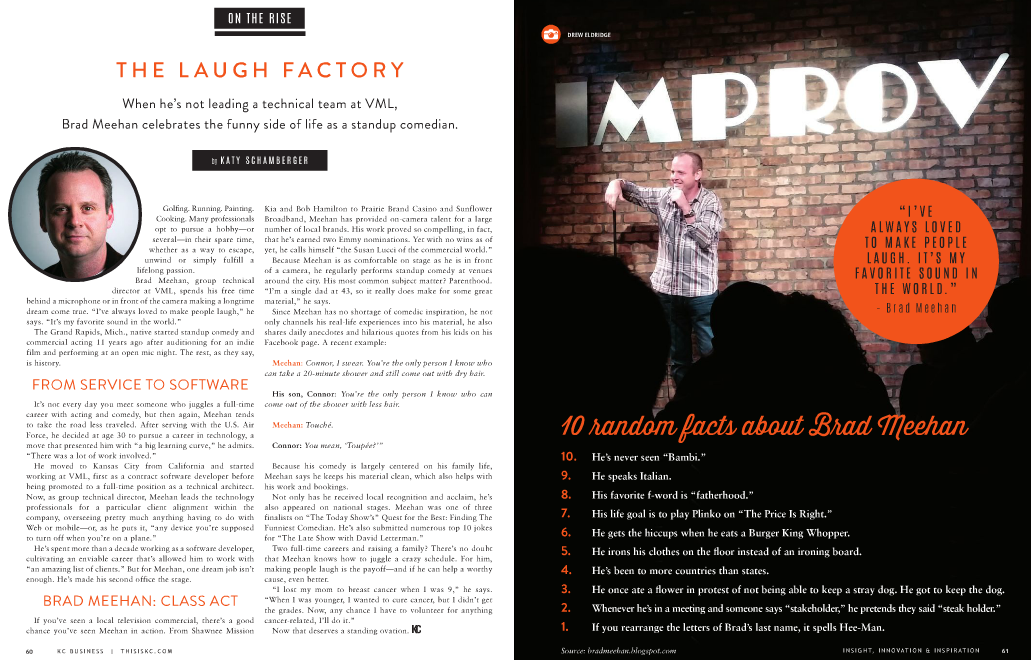
This month, the Kansas City Business Magazine wrote a nice article about me, my work, my comedy career, and my writing. Please take a look! Read the magazine ARTICLE here.
The component name should reflect its usage within its name. A best practice is to prepend its intended usage with the major category of its function. Because the component sidekick sorts component names alphabetically, you can group by prefixing all component names with their major category. For example:
When this list of components is sorted within the component Sidekick, the content author can see the major function of the component and quickly make a decision on which to use without scrolling through an exhaustive, unorganized list. Using this approach in conjunction with the grouping feature of the Sidekick gives the content author a well-organized toolbox to quickly assemble pages.

Sidekick Organization
Joe Gunchy is a dummy! (read more about Joe here. He’s an idiot) He has 7 different components that all have a a group of fields he named, “Link Properties”. Link Properties allows a content author to include a button (or text link) on a page with a name, color selection, link URL, ‘open in new window’ selection, and the ability to attach a downloadable content from the DAM.
The Dialog creation and validation for the first one took about an hour to complete. Then, he delegated the creation of the other 6 components to the developers on his team. He told them what fields should be on the Link Properties dialog and which fields were required. All 6 developers spent an hour and a half on theirs (after all, there is a learning curve to all of this). All of the fields are represented in their Dialogs, but the names of the labels, the order the fields appear in the Dialog, and the validation messaging is different for each variation of the component. Some put all of the fields on a separate Tab (which they named “Tab 1”), while some just appended the fields to the bottom of a really, really, really long Tab.
What if you could create the “Link Properties” Tab once, then reuse it with, say, two lines of code?
“Whatever. You get what you pay for.” – Joe Gunchy
This is perhaps one of the most useful AEM tips I’ve learned.
Once you’ve defined a field that is used on an component Dialog, it isn’t necessary to recreate that field every time you need a similar field on another component. You can easily reuse the field and all of its properties like its labels, help text, and validation rules. For example, if I continually include a field on a Dialog for an “Approved By” name, I can create this field once and reuse it by taking advantage of AEM’s “everything is a resource” rule. That is, every piece of content in AEM has a path and can be retrieved and displayed. In this case, we want to retrieve a JSON representation of the field we want to reuse.
Here’s how…
Navigate to the parent component dialog and find the field you want to copy. In this example, I want to copy the “playSpeed” field from AEM’s out-of-the-box carousel component.
Path: /libs/foundation/components/carousel

/libs/foundation/components/carousel/dialog/items/carousel/items/playSpeed
This path will be pasted into a property on your new dialog with the extension “.infinitiy.json” added to the end. For example:
/libs/foundation/components/carousel/dialog/items/carousel/items/playSpeed.infinity.json
In this example, I named the field “playSpeed” to match its parent. However, you can name the field anything you want. Select cq:Widget as its type.

Create a new Widget

Define the name and type
In the properties editor, add the following properties:
| Name | Type | Value |
| xtype | String | cqinclude |
| path | String | /libs/foundation/components/carousel/dialog/items/carousel/items/playSpeed.infinity.json |

/libs/foundation/components/carousel/dialog/items/carousel/items/playSpeed.infinity.json
/libs/foundation/components/carousel/dialog/items/carousel/items/playSpeed.infinity.json
Note the value of the path property is the path copied from Step 3 with .infinity.json added to the end.
Save your work.
You will now have a field on your dialog with the same values as its parent, including its label, description, and validation rules. This gives the content author a consistent, familiar authoring experience across multiple components.
The world’s worst developer, Joe Gunchy (read more about Joe here) is at it again. He created a new component to give content authors the ability to add rich text onto a page. The content author loves this idea and wants to try it out. They dragged the component onto the page, but there is no indication that the component is on the page and ready to edit. The content author is confused, so they drag another component onto the page. Still, nothing shows up.

Where are the components?
They drag another onto the page, then another, then another. Nothing is displayed. Now the content author has five instances of the component on the page that they don’t know about, forcing the content author to drink from a flask hidden in their bottom desk drawer. Joe Gunchy laughs at the content author. Joe Gunchy is an idiot.
“Content authors are so dumb.” – Joe Gunchy

Five instances of the component
There are a few ways to edit content in a component. Some components contain an “edit bar” to show the editor dialog, while some use “rollover” editing. The component below shows an edit bar above the component with options to add, edit, but, copy, and paste. If you want to edit the content of the component, you click the “Edit” button which opens the editing dialog. Easy.

Edit Bar to launch the dialog
When there is no edit bar, the author must click on the component in the page until they see the green boundary box appear. This is referred to as “rollover editing”. Once that’s selected, you can either double-click within the box or right-click to launch the dialog editor. Joe Gunchy’s component used ‘rollover’, but when there is no content in the component, there is no way to tell the component is on the page. You can mitigate this in the component source code by checking to see if you’re in EDIT mode, then add some default text to the component to show it’s editable. Also, in many cases, it is difficult to click if you do not place your mouse at the precise point within the box to open the dialog, or even worse – components overlap each other and you can’t click them at all.

Roll-over editing (no Edit Bar)
For better usability and consistency across the editing experience, use the Edit Bar on your components and never mix Edit Bar and Rollover on the page. That’s a horrible authoring experience. The Edit Bars below clearly show the author how to edit content on the page and when used exclusively, gives the author consistency when authoring a page. It’s clean, has clear calls-to-action, and doesn’t require default text to know they’re on the page. By adding a few options to the edit bar configuration, you can click on the “Cut” button and easily move them around the page.

To add the edit bar to your component, create an ‘cq:editConfig’ node of type cq:EditConfig under the component. This link shows the various properties to add to the component. Adding cq:actions to the properties allows functionality to move the component around the page.
The table below from the CQ documentation shows the different options for the edit bar.
| Property Value | Description |
| text:<some text> | Displays the static text value <some text> |
| – | Adds a spacer |
| edit | Adds a button to edit the component |
| delete | Adds a button to delete the component |
| insert | Adds a button to insert a new component before the current one |
| copymove | Adds a button to copy and cut the component |
Here are some typical properties to allow editing, moving, and deleting the component from the page. You must have “insert” selected if you want to move the component around the page and replace it between two components.

There is an easy way to force CQ to remove the wrapper when in any mode but EDIT mode.
Add the following snippet at the bottom of your component:
 Adobe AEM The Right Way