Joe Gunchy is a dummy! (read more about Joe here. He’s an idiot) He has 7 different components that all have a a group of fields he named, “Link Properties”. Link Properties allows a content author to include a button (or text link) on a page with a name, color selection, link URL, ‘open in new window’ selection, and the ability to attach a downloadable content from the DAM.
The Dialog creation and validation for the first one took about an hour to complete. Then, he delegated the creation of the other 6 components to the developers on his team. He told them what fields should be on the Link Properties dialog and which fields were required. All 6 developers spent an hour and a half on theirs (after all, there is a learning curve to all of this). All of the fields are represented in their Dialogs, but the names of the labels, the order the fields appear in the Dialog, and the validation messaging is different for each variation of the component. Some put all of the fields on a separate Tab (which they named “Tab 1”), while some just appended the fields to the bottom of a really, really, really long Tab.
What if you could create the “Link Properties” Tab once, then reuse it with, say, two lines of code?
“Whatever. You get what you pay for.” – Joe Gunchy
This is perhaps one of the most useful AEM tips I’ve learned.
Once you’ve defined a field that is used on an component Dialog, it isn’t necessary to recreate that field every time you need a similar field on another component. You can easily reuse the field and all of its properties like its labels, help text, and validation rules. For example, if I continually include a field on a Dialog for an “Approved By” name, I can create this field once and reuse it by taking advantage of AEM’s “everything is a resource” rule. That is, every piece of content in AEM has a path and can be retrieved and displayed. In this case, we want to retrieve a JSON representation of the field we want to reuse.
Here’s how…
- Select the component widget you want to copy into your new component’s dialog.
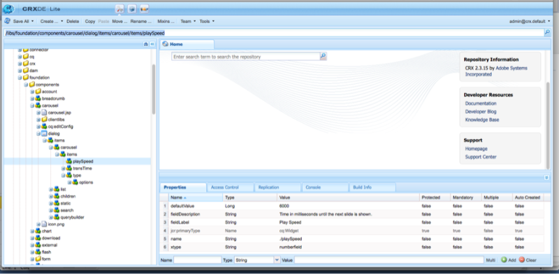
Navigate to the parent component dialog and find the field you want to copy. In this example, I want to copy the “playSpeed” field from AEM’s out-of-the-box carousel component.
Path: /libs/foundation/components/carousel
- Copy the path of the widget as shown in the address bar beneath the menu items. In this example, the playSpeed widget has the path:
/libs/foundation/components/carousel/dialog/items/carousel/items/playSpeed
This path will be pasted into a property on your new dialog with the extension “.infinitiy.json” added to the end. For example:
/libs/foundation/components/carousel/dialog/items/carousel/items/playSpeed.infinity.json
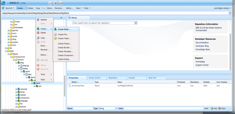
- On your new component, create a new widget by selecting CREATE > CREATE NODE.
In this example, I named the field “playSpeed” to match its parent. However, you can name the field anything you want. Select cq:Widget as its type.
In the properties editor, add the following properties:
| Name | Type | Value |
| xtype | String | cqinclude |
| path | String | /libs/foundation/components/carousel/dialog/items/carousel/items/playSpeed.infinity.json |
/libs/foundation/components/carousel/dialog/items/carousel/items/playSpeed.infinity.json
Note the value of the path property is the path copied from Step 3 with .infinity.json added to the end.
Save your work.
You will now have a field on your dialog with the same values as its parent, including its label, description, and validation rules. This gives the content author a consistent, familiar authoring experience across multiple components.


Nice article – we will promote this on the AEM community page.
Does this work with dialogs in the new Touch UI? My understanding is that this new UI doesn’t support xtypes.
Hi Trevor, I’m Bryan Stopp. I work at VML with Brad. I’m the Platform Architect for AEM implementations.
Unfortunately there isn’t anything like an xtype in the TouchUI. xtypes are specifically a ExtJS thing (ExtJS is the Widget framework used in the Classic UI).
The Touch UI uses an Adobe specific framework called CoralUI (CUI, pronounced COOEY). The widgets in it are built on jQuery UI widgets, but provide a standardized look & feel.
If you look at the Touch-UI dialog node structure in the AEM out-of-the-box components, all of the widget definitions are sling:resourceTypes, so it’s much more Sling appropriate from a configuration/persistence perspective. Here’s a link to the docs:
http://docs.adobe.com/docs/en/cq/5-6/touch-ui/coral-ui/index.html
Unfortunately it is very lacking. If you want to know how to actually do something you have to dig into it. Adobe hasn’t really gone through and documented it well. For example there is a specific sling:resourceType that means a dialog, another that means two tabs, and another for a text input. However what they are and how they work isn’t specified anywhere. Hopefully this will change as more functionality is driven away from the ClassicUI to the TouchUI.
On the up-side, it should be much more extensible than the ExtJS widgets. So if you have a team of front end developers, you can create fully functional, custom dialogs with the jQuery UI framework quickly.
-Bryan Stopp
Another link to some more documentation; may provide more insight on how the Touch UI works.
http://dev.day.com/docs/en/cq/current/touch-ui/granite-reference.html
-Bryan Stopp
Thank you very much for taking time to answer my question, and so thoroughly too! The sling:resourceType property is exactly what I needed!
Hi, I noticed this pattern used in a project I’m working on and a developer pointed me to your blog as the source of this practice.
While it’s a valid way of reusing existing code, there’s one concern I have about this specific way of reusing dialog fields.
If you look at the referencing dialog, it’s quite obvious what it’s using. Just cast a glance at the path and you know it has the same configuration as the carousel component.
/libs/foundation/components/carousel/dialog/items/carousel/items/playSpeed.infinity.json
However, this cross-reference is not as clear to someone working on the carousel component. There’s no way to tell if the playSpeed field is reused anywhere outside the carousel unless you explicitly look for it. It can lead to someone introducing an undesired change into another component, thinking they’re only changing the carousel to support additional carousel-specific properties.
Because of this, I prefer to split common fields (or more often, entire tabs) to completely separate files somewhere in my components folder and reference them from every dialog that uses them. This way it’s more obvious to future maintainers of the code that this is a shared piece of code/content and a change introduced to it can affect more than one component.
In this specific case, I think playSpeed should cease to be defined at carousel level and redefined as a reusable node to be referenced by player-like components wherever applicable.
This is great feedback and a solid solution. Would you mind if I made this a guest post from you? Please shoot me an email and we can discuss.
I don’t see why not. I’ll give you a shout via email.
Very use full article ,i really like it, but i have one doubt regarding addition of “.infinity.json”.
Can we only add “.json” instead of “.infinity.json” ?
Great, thank you for share.
Hi,
Can we reuse teh complete dialog by using the same technique? Or do we need to do anything else when we want to reuse the complete dialog from one component to another?
Please advice!
Thanks! – Rashid
You can, but in this case it would make more sense to just declare the parent component as the sling:resourceSuperType then overlay the new functionality for your component. I feel if you’re using all of the same fields from a parent components, you need to evaluate if a new component is necessary or does it just LOOK different.